
TDM Studio is ProQuest’s text and data mining platform. This platform enables researchers to create datasets using licensed ProQuest content and analyze those datasets by running Python or R scripts in an accompanying Jupyter Notebook. A component of TDM Studio is Data Visualizations, a platform for researchers with little to no coding experience. Data Visualizations is accessible to any member of the Mason community.
The first feature of Data Visualizations is geographic analysis. Geographic analysis maps articles based on locations named within the articles. All articles come from publications GMU subscribes to through ProQuest, and includes such titles as the New York Times, Washington Post, and Los Angeles Times. Users can create up to five unique projects, and each project can contain up to 10,000 articles. Other methodologies, including topic modeling, sentiment analysis, and ngram/term frequency, are currently in development, as is an export data functionality.
Accessing ProQuest TDM Studio: Data Visualizations
- Go to tdmstudio.proquest.com/home.
- Click log in to TDM Studio.
- Click create an account. Enter your GMU email address; read through the terms of use, and check the box if you consent; click create account.
- You will receive an email to your GMU account. Click the link in the email to confirm the creation of your account.
- Begin using Data Visualizations.
Using ProQuest TDM Studio: Data Visualizations
- Once you’re logged in, you will be directed to the visualization dashboard. From the dashboard you are able to manage and interact with your projects using analysis methods. You can create up to five projects. Click create new project to begin.
- In the search box, enter your search terms. The following publications will be searched for the specified terms: Chicago Tribune; Washington Post; Wall Street Journal; New York Times; The Globe and Mail; Los Angeles Times; The Guardian; Sydney Morning Herald; South China Morning Post; and Times of India.
- You will refine the dataset. Only 10,000 documents can be analyzed per project. You can refine your search by publication; date published; and document type. Click next: review project when finished.
- You will be given a summary of your project that includes document count; publications; and the selected analysis. Enter a descriptive project name and click create project.
- A dialog box will appear that says your project was successfully submitted. Once you close the message you will be redirected to the visualization dashboard.
- Your project will take time to generate. You will see the name; date range; search query; count; publications; and analysis method listed for your newly created project. Once the project has been successfully generated, you can click show actions. Click delete if you wish to delete the project. Click open geographic visualization to open the visualization.
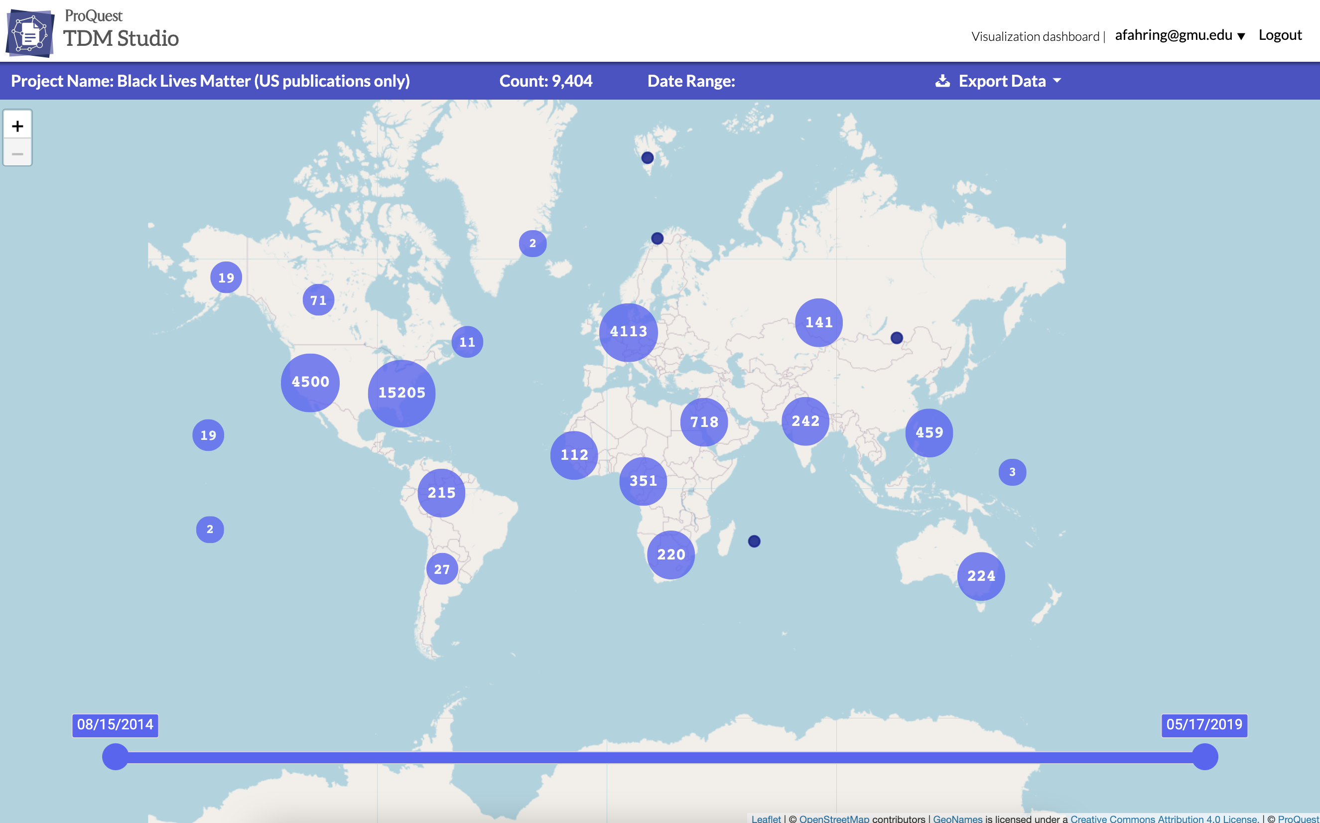
- The geographic visualization will open with a global view. The top menu includes the project name; the number of articles in the project; date range; and an option to export data.
- Click on a cluster or map marker. A drawer will open on the right hand side of the screen that includes the articles included in that cluster or marker. The larger the cluster, the longer it will take for the drawer to open. If you click on the title of an article, a new tab or window will open and you will be directed to the article itself. Click hide articles to close the drawer.
- You can use the slider along the bottom of the map to change the date range. The map will update to reflect the new date range.
- Later updates to the platform will enable users to export data.
Want to try out Data Visualizations? Follow the link listed above, or you can find Data Visualizations on the Libraries’ A-Z Database list.
If you have questions about Data Visualizations or TDM Studio, contact the Digital Scholarship Center (DiSC) at datahelp@gmu.edu.